Open source · MIT · pip + conda

Reproducible bioinformatics,
one line at a time.

An SDK + cookbook that runs real analyses on your own machine — every tool a digest-pinned Docker BioContainer, every run self-documenting. No cloud account, no lock-in.

pip install bioflowkit Read the docs Star on GitHub
# assemble + annotate a genome, end to end
$ bioflow recipe run prokaryote_assembly \
      --r1 reads_R1.fastq.gz --r2 reads_R2.fastq.gz --out ./run

   fastp → SPAdes → QUAST → Prokka → GenoVi genome map
   provenance.json + ro-crate-metadata.json written
   overview → run/results/overview.html

Built for results you can trust

Most tools optimise for speed. bioflow optimises for the thing that actually matters in research — being able to reproduce, audit, and explain what you ran.

Reproducible by default

Every container is pinned by image digest, every run records input SHA-256 + commands + image digests as an RO-Crate. Unchanged inputs hit the cache.

Curated & tested

20 hand-written recipes, a nightly real-tool integration matrix, and a guard that statically catches “wrong image” bugs before they ship.

Runs anywhere

Your workstation with Docker, or an HPC cluster with Apptainer/Singularity — no daemon needed. Podman and GPU pass-through supported.

Open & inspectable

MIT-licensed, on PyPI and bioconda. No black box: read every recipe, swap any tool, and an optional privacy-first LLM helper stays off by default.

How it works

One CLI line orchestrates a chain of single-tool containers over a shared workspace — bioflow never installs a bioinformatics binary on your host.

1

Pick a recipe

Call one curated pipeline, or compose your own with the @stage / @pipeline SDK in Python.

2

Each tool, its own container

Stages run as sibling BioContainers pinned to a digest — fan out across samples with bioflow cohort.

3

Tidy results + an overview

You get analysis-ready tables, full provenance, and an auto-built report that links each tool’s own figures.

20 recipes, one command each

From comparative genomics to RNA-seq, assembly, variants, metagenomics, epigenomics, single-cell and proteomics.

pangenomephylogeny ani_matrixprokaryote_assembly eukaryote_assemblyrnaseq_deg germline_variantsjoint_genotyping metagenomics_profilemetagenome_assembly scrna_seqchip_seq atac_seqmethylation_wgbs proteomics_ddagwas cog_enrichmentcafe_evolution amr_vf_cataloguedownload_taxon

Tools researchers actually use

bioflow curates field-standard tools, not obscure ones. Here are the most-cited in the recent literature — measured by how often each tool's canonical paper was cited (Europe PMC), refreshed monthly.

#ToolCategoryCites 2021–2025
1deseq2deg52,540
2starrnaseq_align29,078
3starsolosingle_cell29,078
4bowtie2alignment25,521
5mafftcomparative_genomics19,262
6edgerdeg19,177
7bwaalignment18,313
8fastpqc17,361
9subreadrnaseq_align15,592
10bedtoolsalignment13,559
11bcftoolsvariant_calling10,492
12samtoolsalignment10,492

Citation counts are a lower bound on real use; the full per-tool table is in the tools reference.

Reproducibility isn’t a feature.
It’s the default.

  • Digest-pinned images — a silently re-tagged upstream image can’t change your result.
  • Run provenance — input hashes, image digests, commands and timestamps as an RO-Crate.
  • Input-hash caching — re-running with unchanged inputs returns in seconds.
  • Hardware-aware — every tool classified against your CPU / RAM / GPU before it runs.
  • CI-enforced — image-capability guard + digest audit gate every change.
{
  "stage": "assemble",
  "image": "staphb/spades:4.0.0",
  "image_digest": "sha256:…",
  "inputs": { "reads": "sha256:9f2c…" },
  "command": "spades.py -k auto …",
  "started_at": "2026-06-30T07:54:…Z"
}

excerpt from provenance.json

Visualisation, done honestly

bioflow doesn’t reinvent plotting. It runs the field-standard visual tools as stages and surfaces their own output — a report hub plus the tidy data, so you plot the rest.

Layer 1 · tidy data

One row per sample + a results.json schema. Load it in R/Python and make any figure.

Layer 2 · overview

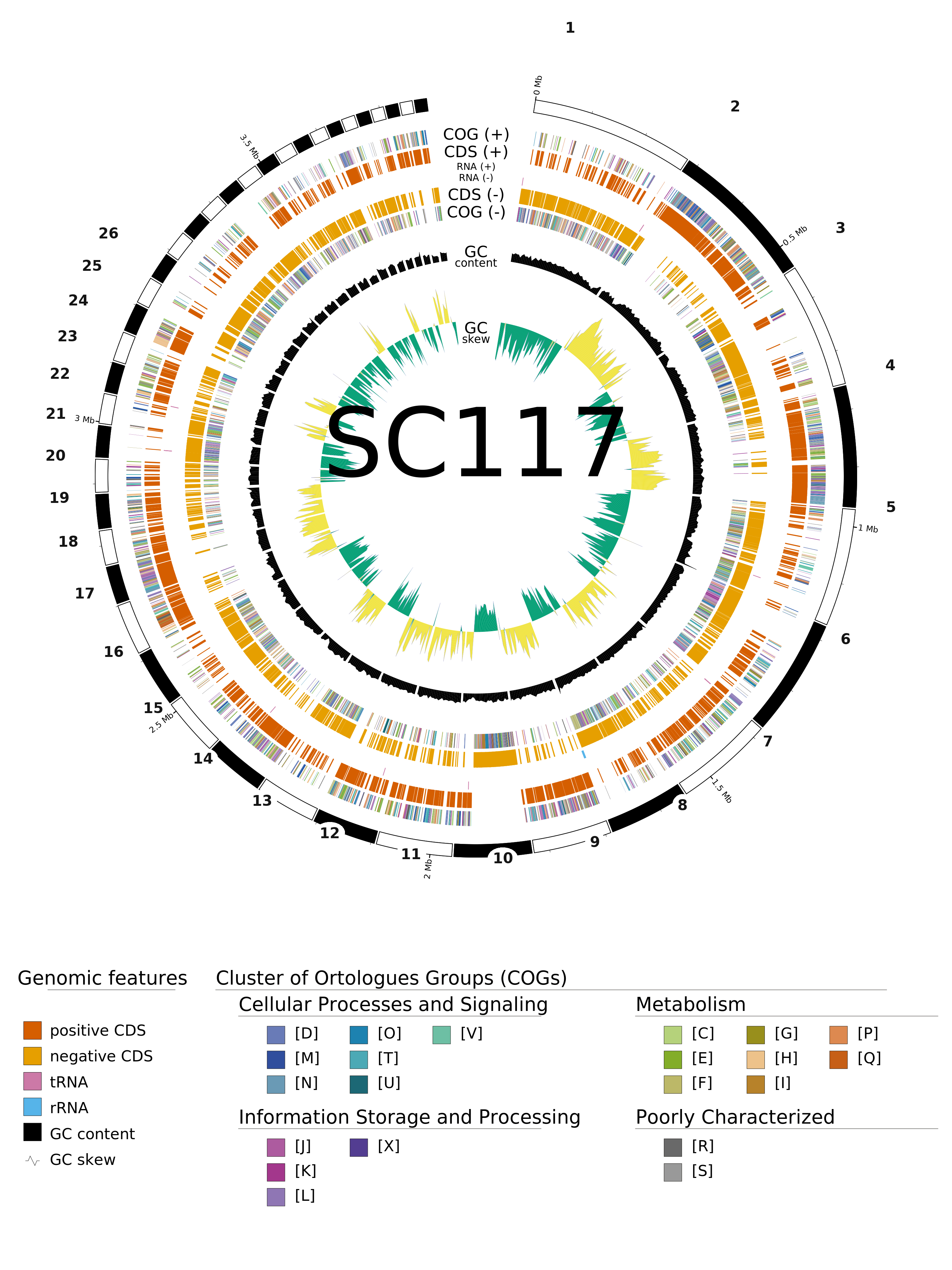
A metrics table + a circular genome map (GenoVi/Circos), the assembly graph (Bandage), QUAST/Icarus and fastp reports — embedded or linked, never redrawn.

Layer 3 · interactive

Standard BAM / BED / GFF outputs open straight in IGV — we delegate, we don’t lock you in.
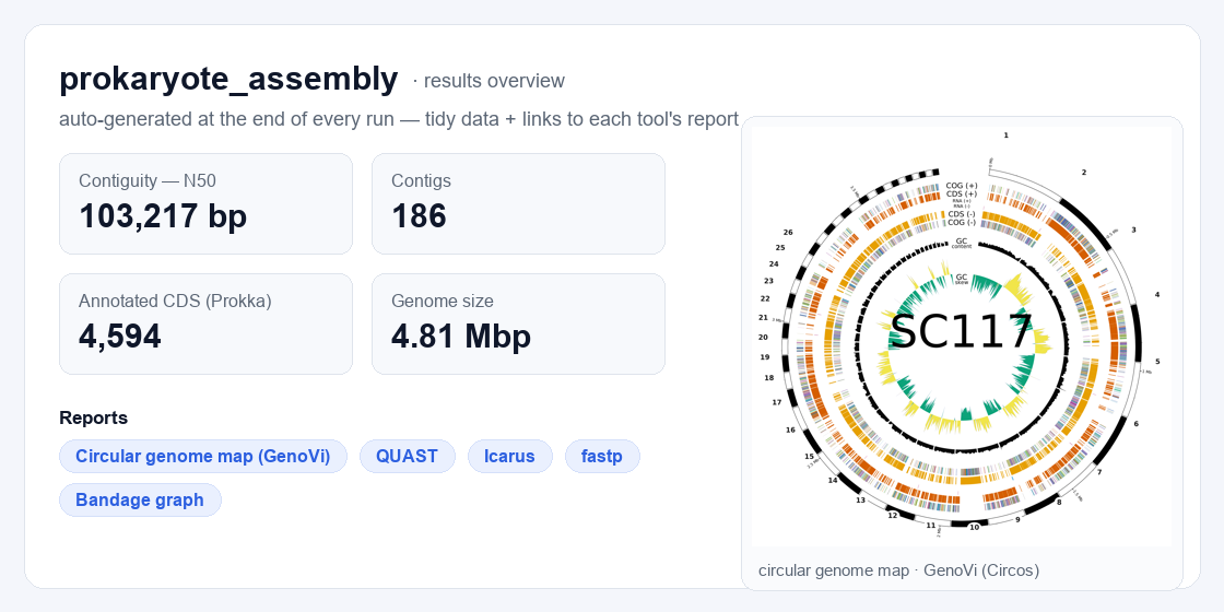
bioflow results overview: labelled metrics (N50, contigs, CDS, genome size), one-click links to each tool's report, and the embedded GenoVi circular genome map
A real results overview — labelled metrics, a circular genome map rendered by GenoVi (Circos), plus one-click links to each tool's own report (QUAST, Icarus, fastp, Bandage), generated automatically at the end of the run.
Circular genome map of the SC117 draft assembly rendered by GenoVi (Circos): a numbered contig ring with a cumulative Mb scale, CDS coloured by COG category on both strands, tRNA/rRNA, GC content and GC skew, with a full colour legend
Circular genome map of the SC117 draft assembly. Rings, outermost to innermost: contigs (numbered 1–26 by descending size, with a cumulative Mb scale); protein-coding genes on the forward (+) and reverse (−) strands, coloured by COG functional category; tRNA / rRNA; GC content (black, deviation from the genome mean); and GC skew (green / yellow). Only contigs large enough to label are numbered; the full colour key is at the foot of the figure. Rendered by GenoVi (Circos) from the Prokka annotation as the pipeline's genome_plot stage — the actual, unedited output of a bioflow recipe run.
113pinned tools
16categories
20one-line recipes
MITopen source
pip install bioflowkit Get started ↗

Requires Python ≥ 3.9 and a reachable Docker (or Apptainer on HPC).